
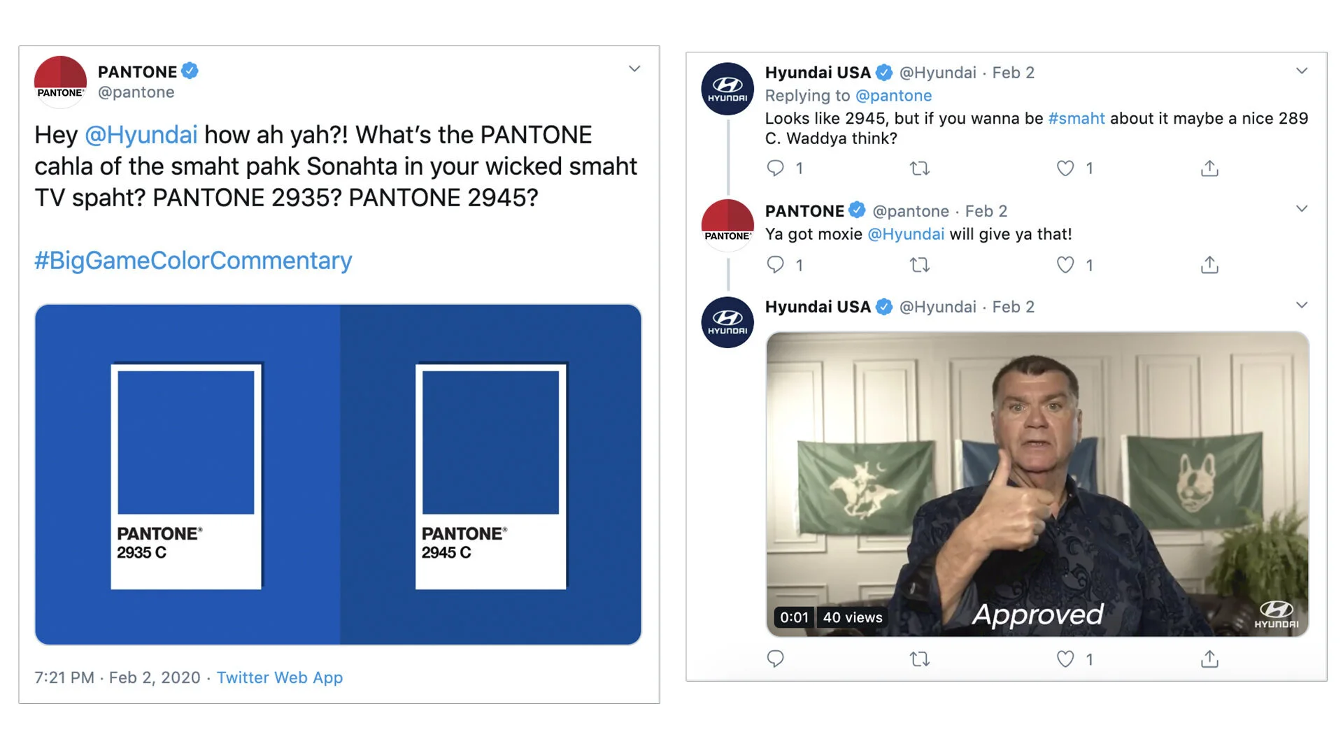
PANTONE #BigGameColorCommentary
This year's Super Bowl featured two teams with two very similar primary colors:
The San Francisco 49ers (Pantone 187 C)
The Kansas City Chiefs (Pantone 186 C).
HUGE just happened to have the Pantone account, so we had some fun and helped this incredible client, the global standard for color management, engage in a real time conversation about color and the "BIG GAME." Since - you know - you can’t throw the words Super Bowl around without paying for it.
Under the leadership of CCO Jason Musante, a small team and I - including the expert Jae Wu as art director - willed this into reality in just a few weeks.
Kudos to Pantone for being an awesome client. This was a fun one.
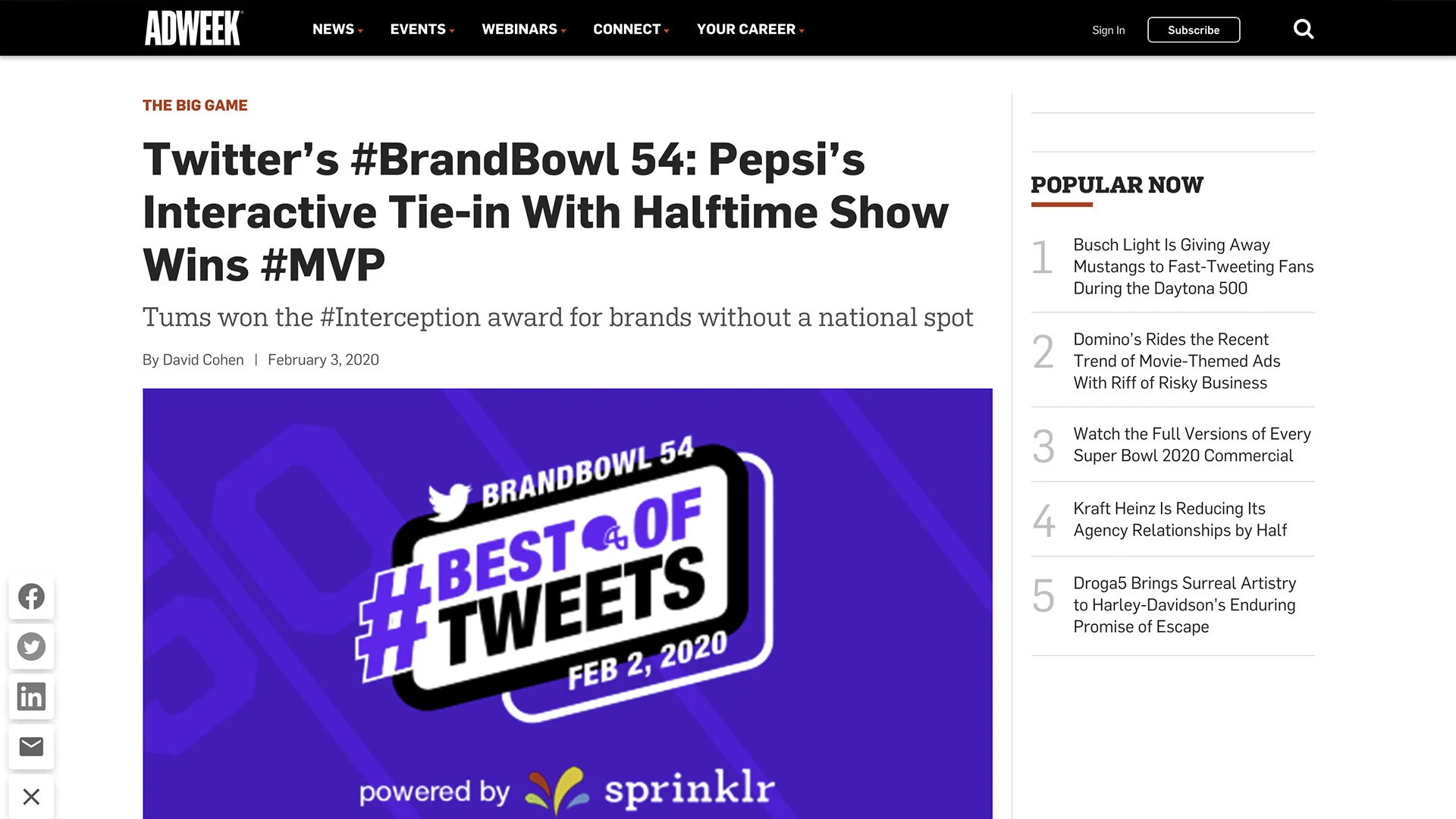
Even got some press including some love form ADWEEK:


ADWEEK LOVE
The project got a good amount of love in the trades.


TWEETS AND TWEETS AND TWEETS
Here’s a bunch more - some written to brands and some in the topic of the “Big Game”.
Click to zoom.


